Dr. D’Orsey — Brand Identity Concept
x
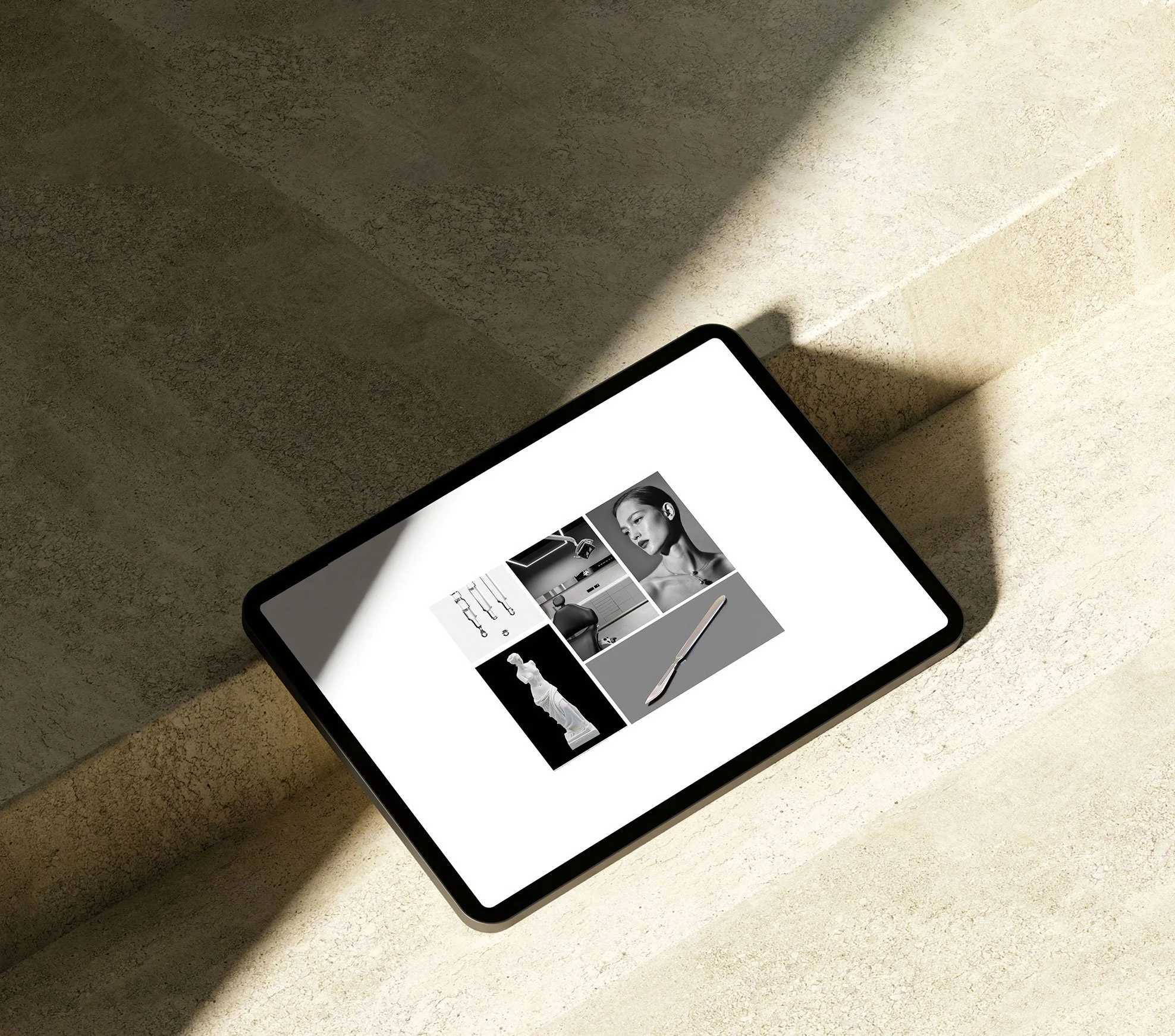
A study in restraint and structure, the moodboard sets a tone that balances classical cues with clinical clarity.

Clinic's new minimal logo symbol.

The desktop design uses a restrained black-and-white palette. Large, editorial-style imagery paired with minimal typography conveys precision.
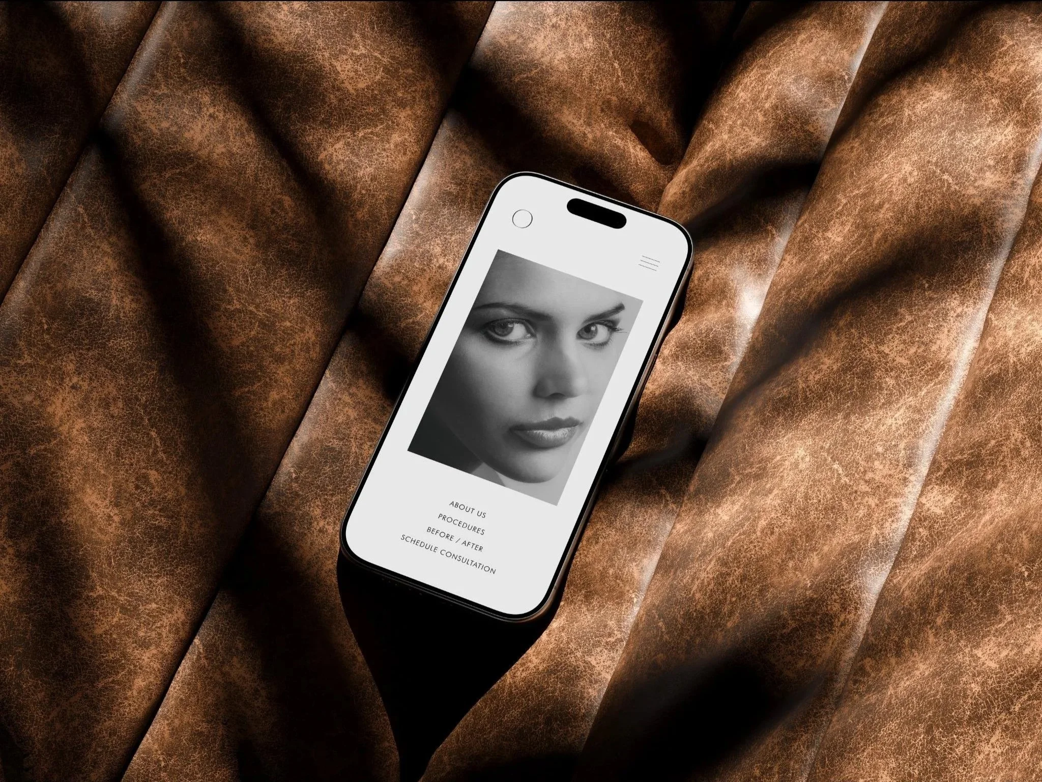
On mobile, the site is engineered for refinement and high performance. Responsive scaling, generous spacing, and touch-friendly navigation make the content feel easy to explore, providing the seamless digital experiences the audience expects.
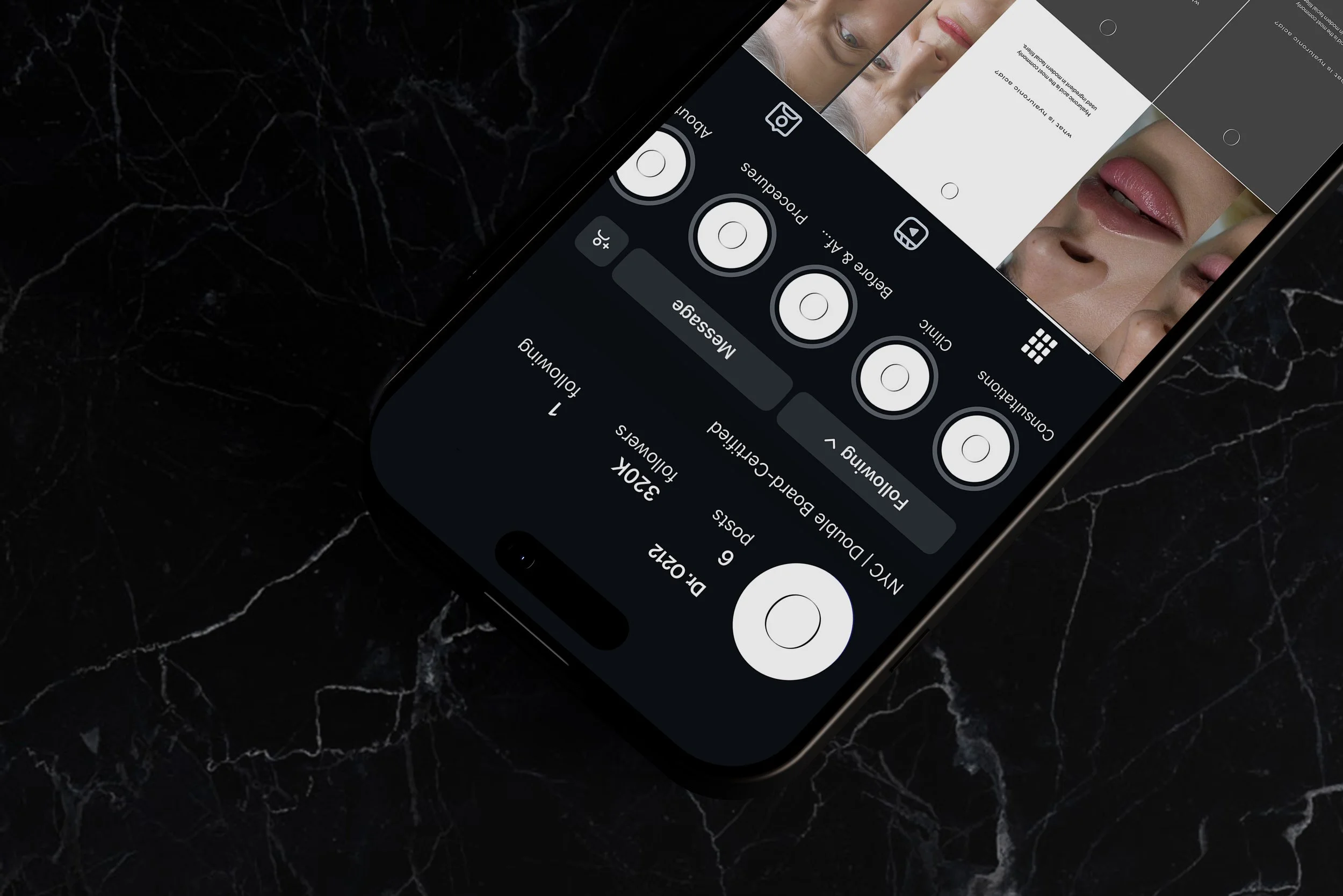
The Instagram feed acting as a portfolio, arranged like a magazine layout: alternating imagery, text, and negative space.
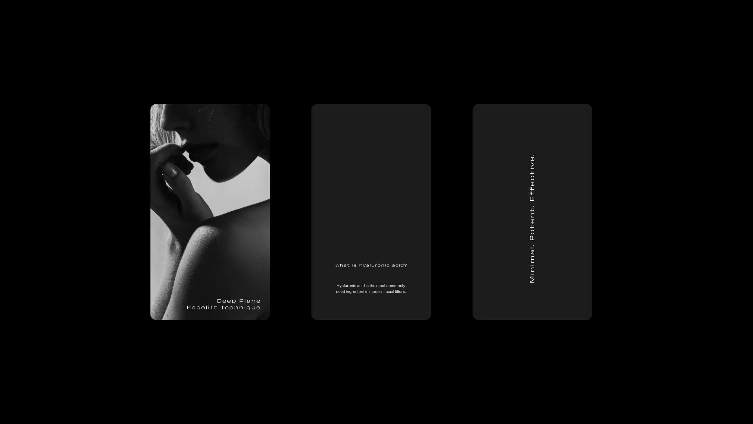
Content templates built to reflect medical authority while maintaining high design standards.
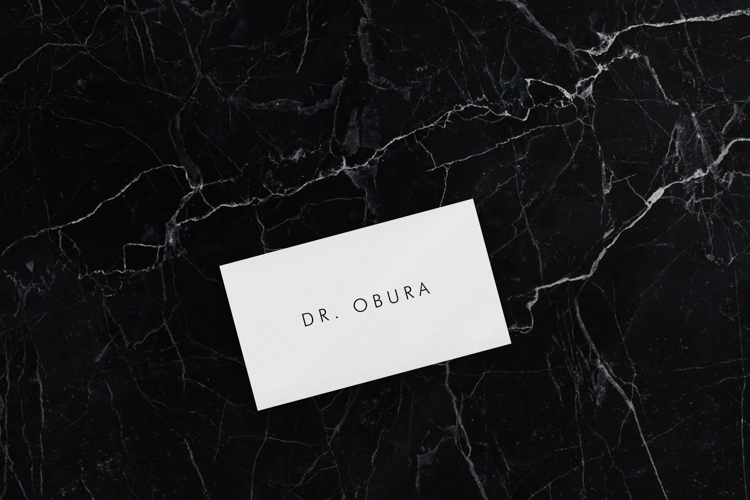
Minimalist business card featuring the clinic's wordmark, printed on textured premium stock for in-clinic use.
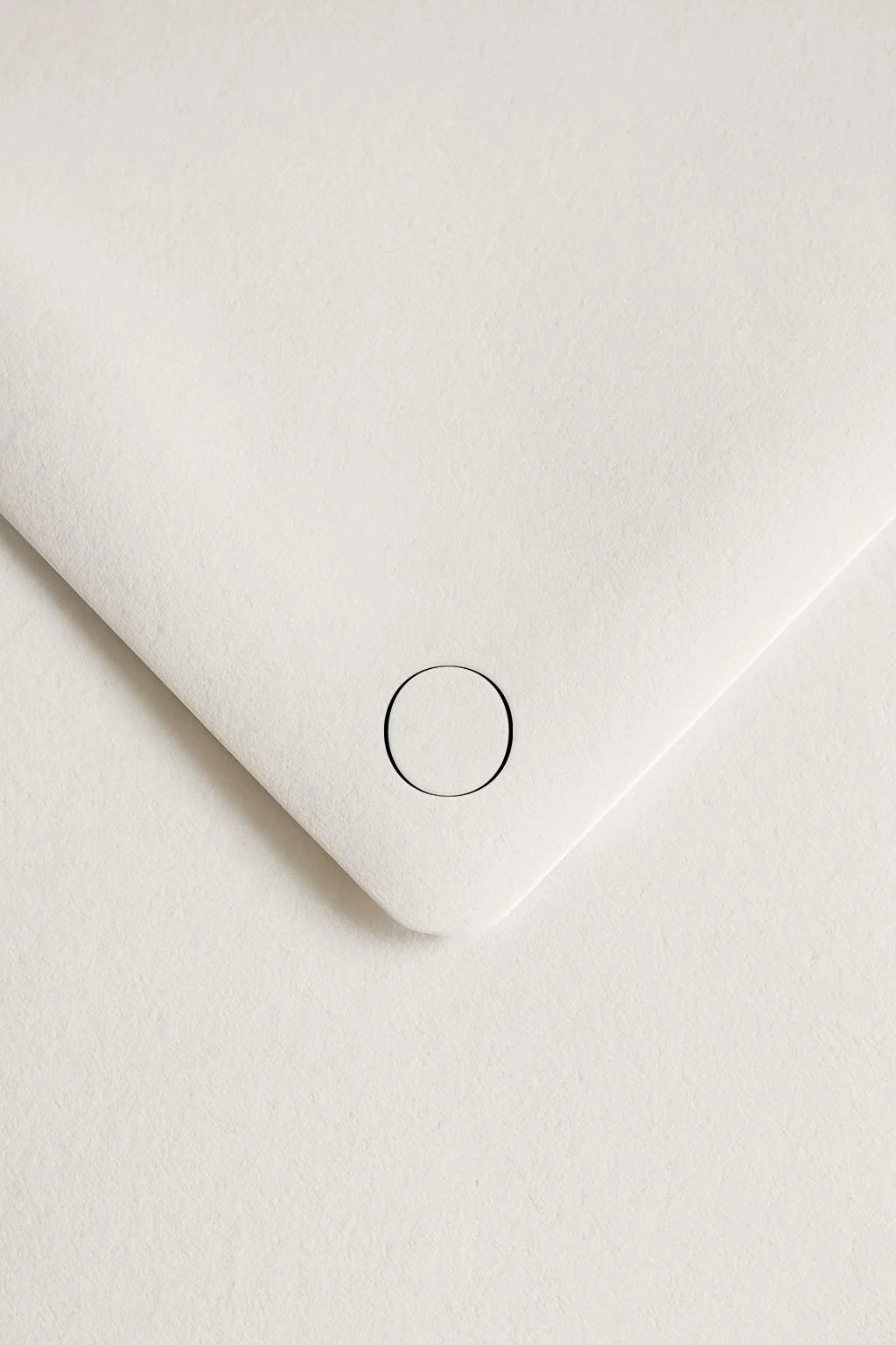
Logomark application on envelope.
Book Your Complimentary Strategy Call
Book a 30-minute strategy call to review your clinic’s brand presence and marketing, with direct recommendations to strengthen patient trust and demand.