Dr. O.212 — Brand Identity Concept
Dr. O.212 is a conceptual brand identity built around the principles of precision, minimalism, and restraint.
-
Dr. O.212 is a license-ready brand identity created for a cosmetic surgery clinic, tailored for a practitioner who seeks to convey control, subtlety, and elevated visual authority through their branding.
What’s Included:
Seamless Brand Identity Across Every Digital Format
2 Logo Variations: Custom Wordmark & Logo Symbol
Typography & Layout System
Custom Color Palette
Responsive Website Design (Mobile, Tablet, Desktop)
6 Branded Social Media Templates
6 Brand-Aligned Editorial Images for Web & Social Use
Business Card & Envelope Design
Brand Voice Guidelines
Before & After Content Guidelines
-
Dr. O.212 is built around the principles of precision, minimalism, and restraint. The custom logotype and circular emblem convey control and intentionality, while the spacious layout emphasizes clarity over clutter.
The monochrome color palette reinforces clinical cleanliness and timeless elegance — a deliberate choice to avoid trend-based hues and instead evoke enduring trust. Editorial typography and high-contrast lighting bring structure and sophistication, while visual references to sculpture, surgical tools, and soft skin tones introduce a sensual edge within a strict visual frame.
Every design element is pared back to its essentials, creating a brand world that feels exact, elegant, and emotionally grounded.
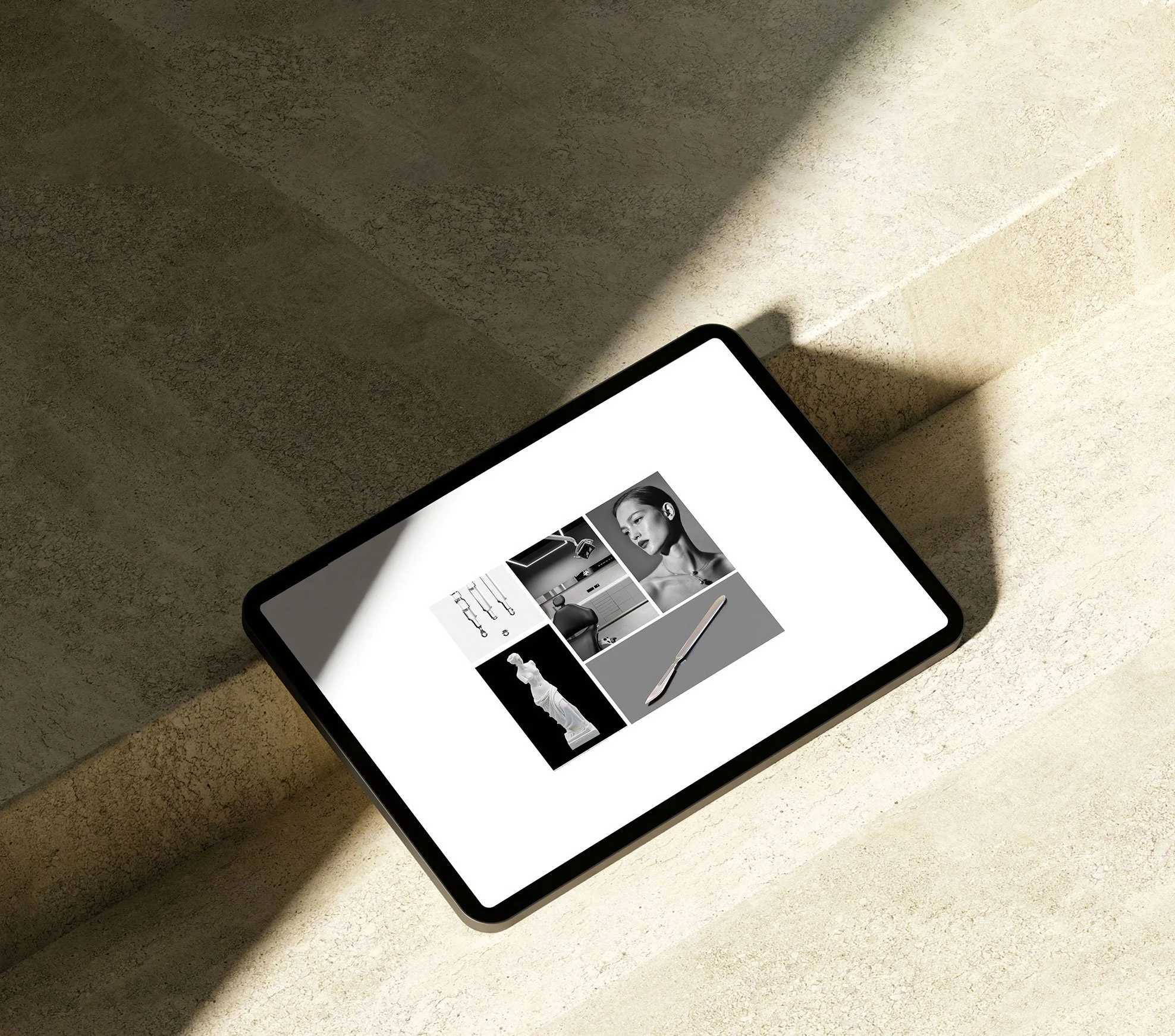
A study in restraint and structure, the moodboard sets a tone that balances classical cues with clinical clarity.

Clinic's new minimal logo symbol.
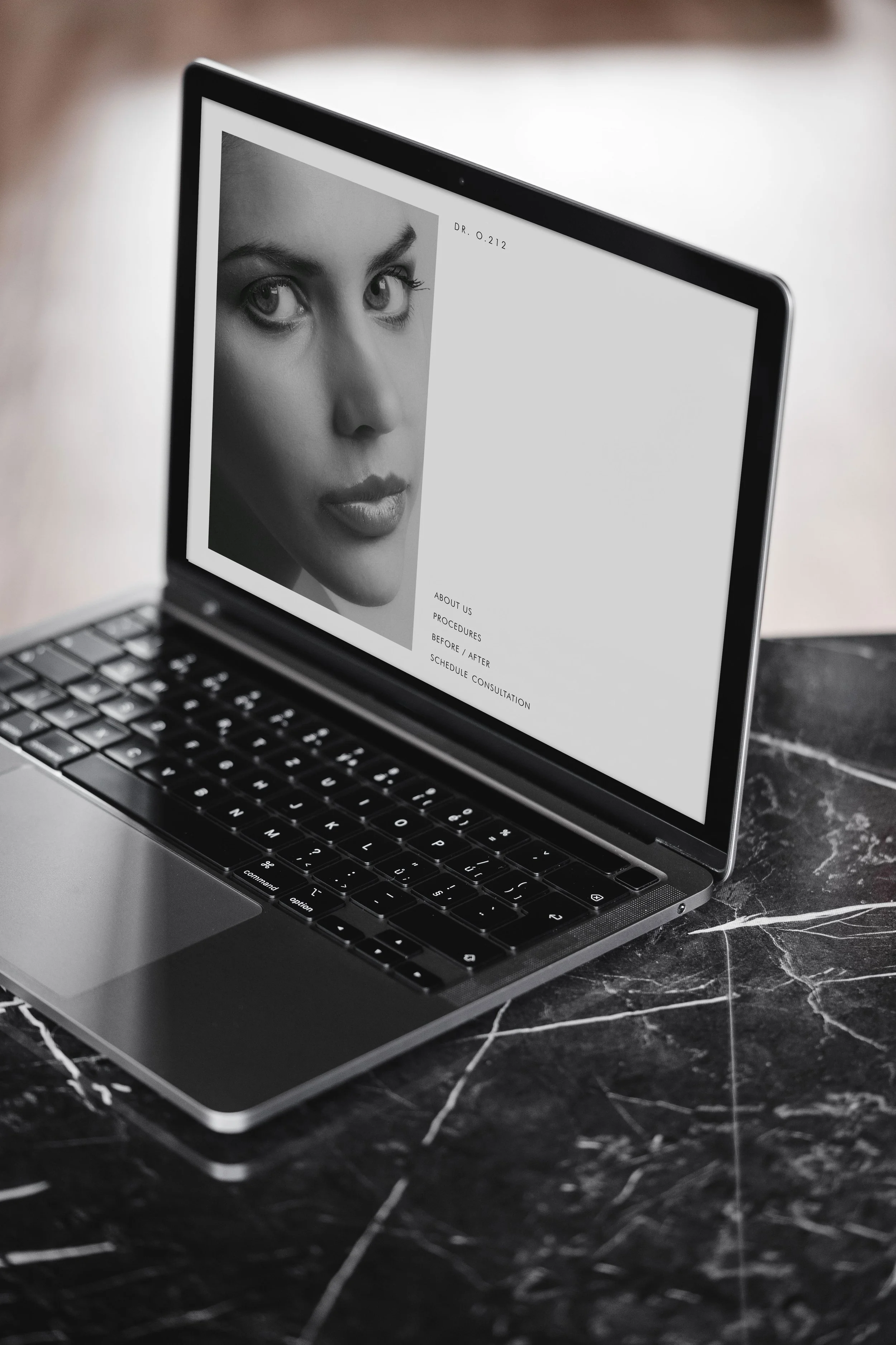
The desktop design uses a restrained black-and-white palette. Large, editorial-style imagery paired with minimal typography conveys precision.
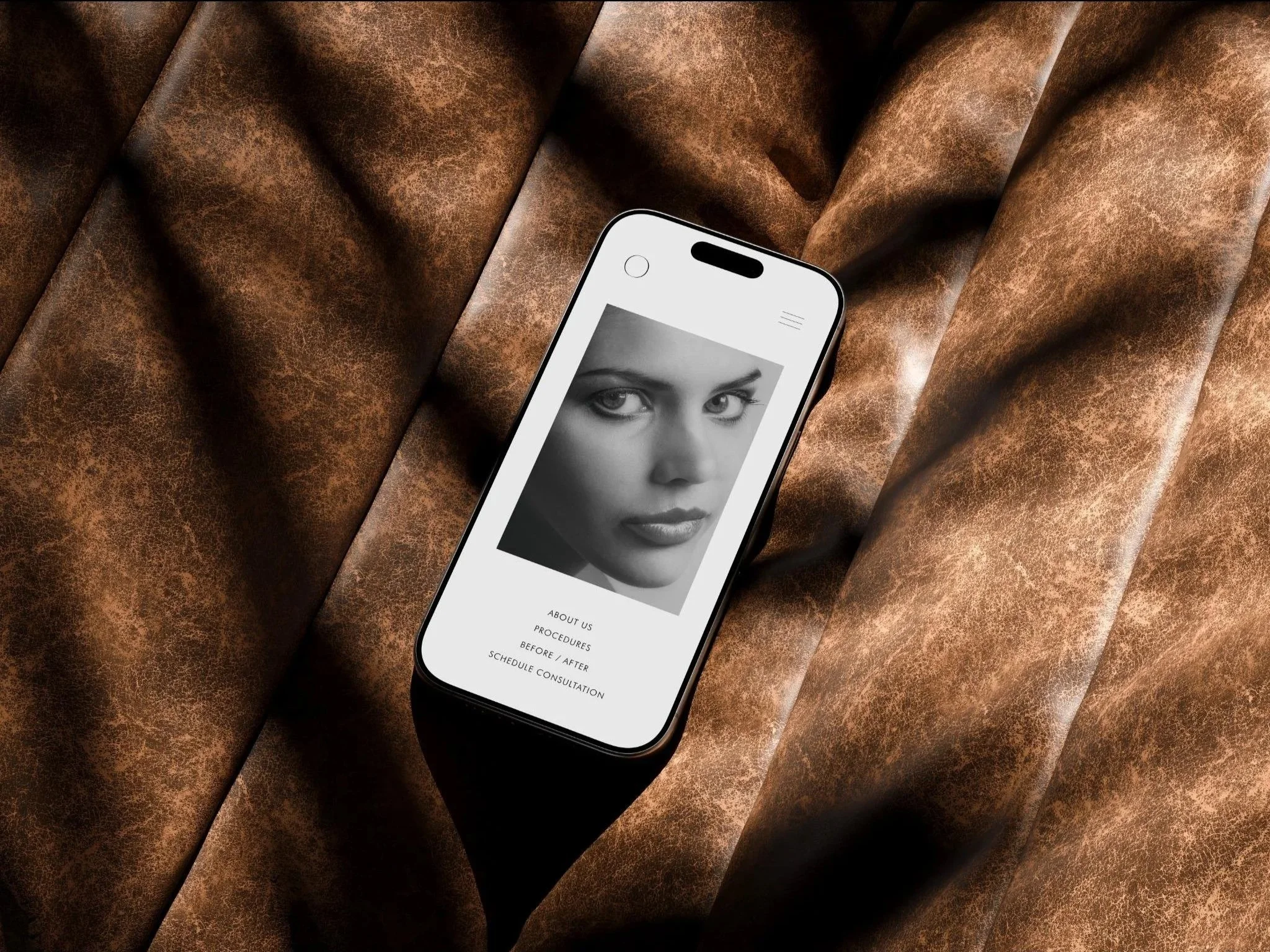
On mobile, the site is engineered for refinement and high performance. Responsive scaling, generous spacing, and touch-friendly navigation make the content feel easy to explore, providing the seamless digital experiences the audience expects.
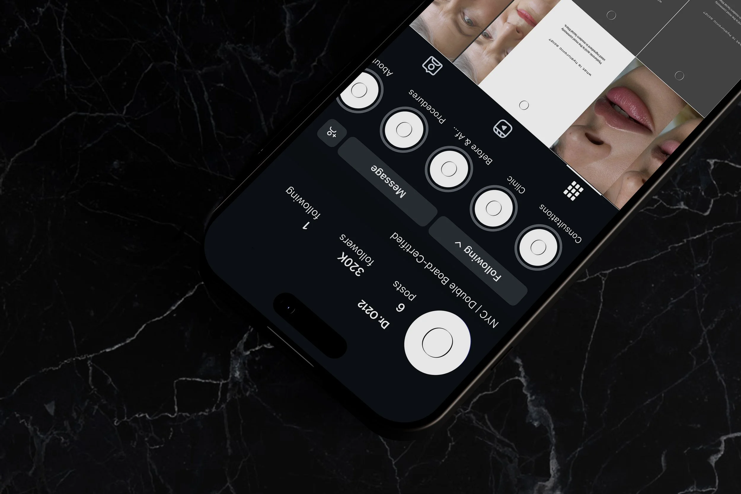
The Instagram feed acting as a portfolio, arranged like a magazine layout: alternating imagery, text, and negative space.
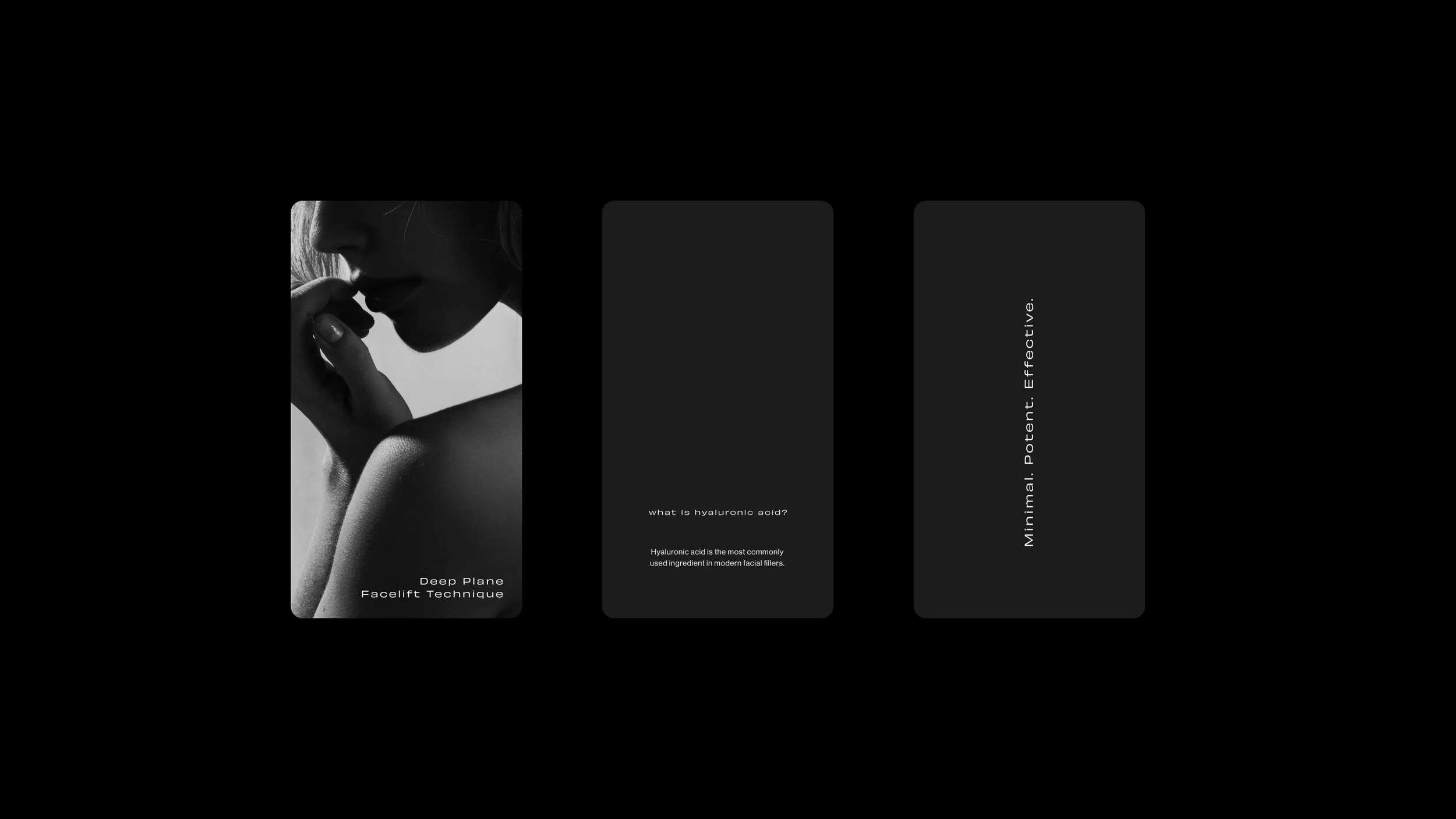
Content templates built to reflect medical authority while maintaining high design standards.
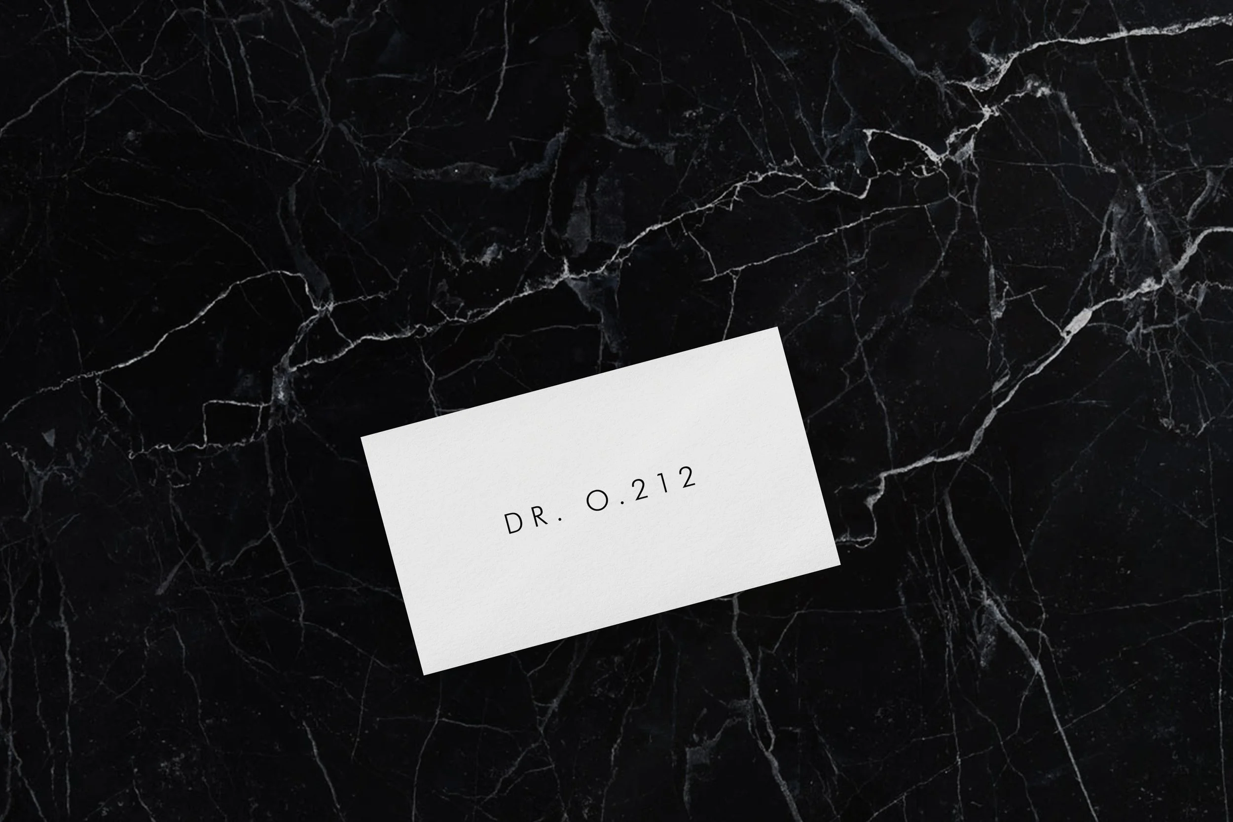
Minimalist business card featuring the clinic's wordmark, printed on textured premium stock for in-clinic use.
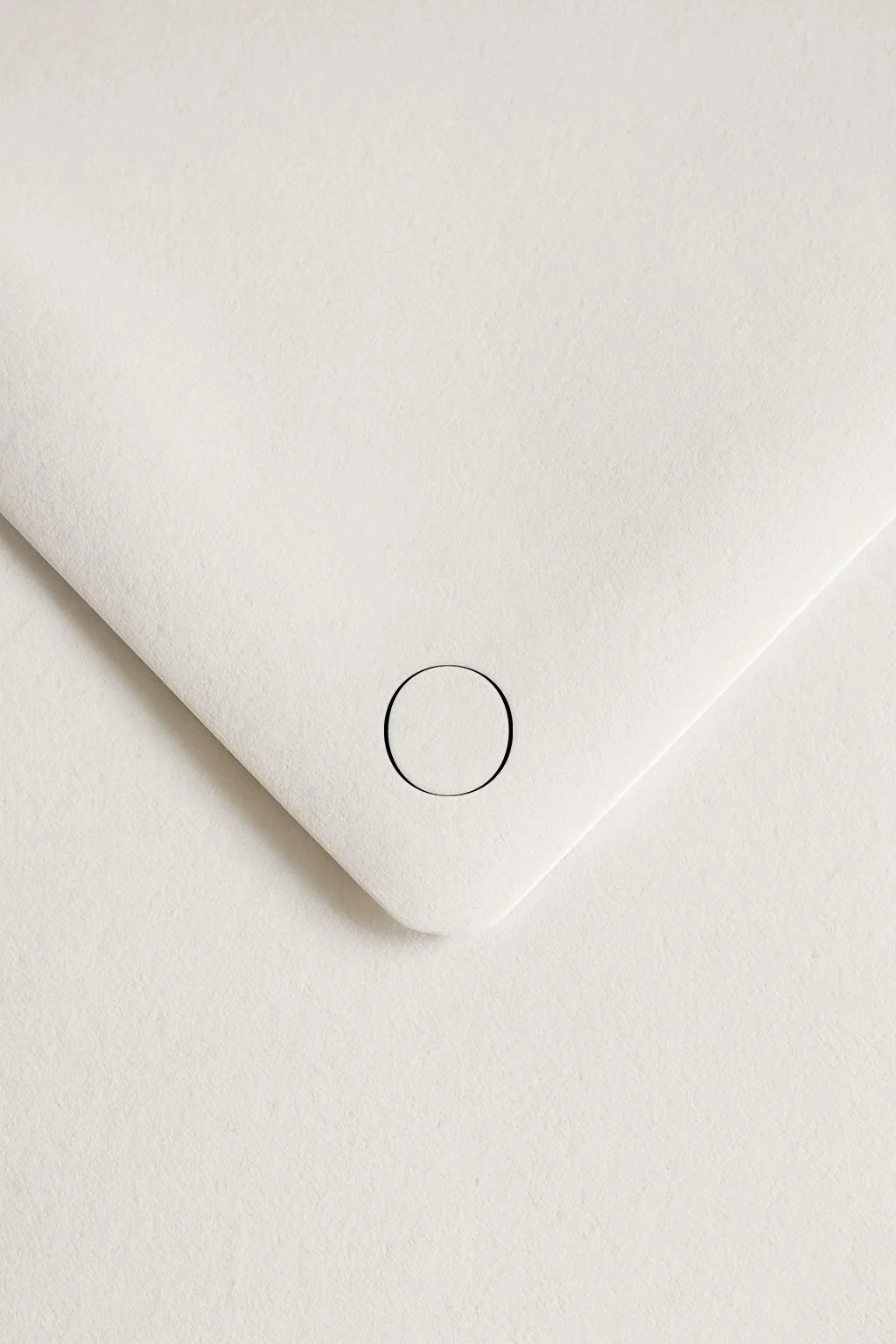
Logomark application on envelope.