AHLSTEN-STAHLBERG GALLERY
-
Ahlsten-Stahlberg Gallery curates museum-quality art prints and original works that bring a sense of depth and refinement to contemporary spaces.
The gallery needed a brand identity that felt as considered as its collection - minimal, precise, and quietly magnetic. Our goal was to build a brand that would resonate with collectors, curators, architects, and interior aesthetes seeking refined, timeless visual statements.
-
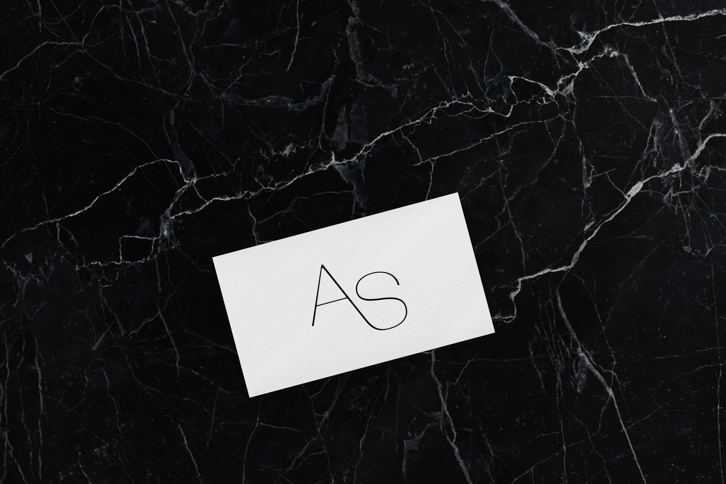
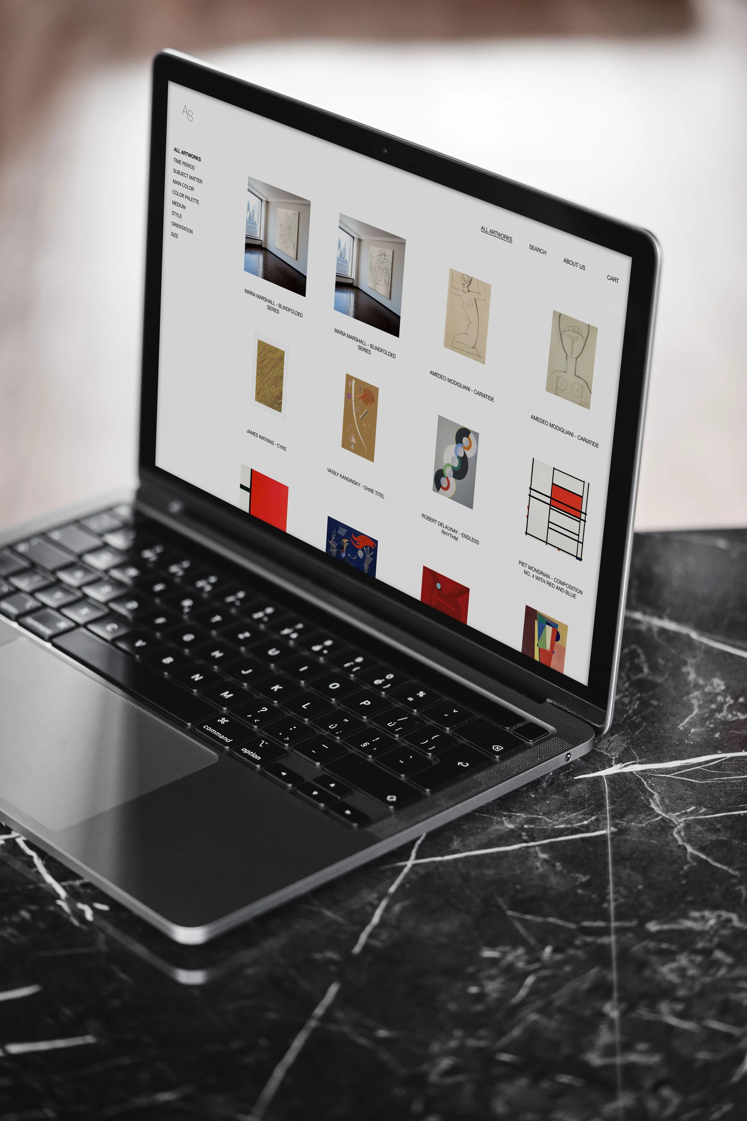
The design language is minimal, editorial, and timeless. The AS monogram is set in a custom logotype that mirrors the gallery’s blend of sensitivity and structure. It’s paired with a monochromatic palette, elevated serif and sans-serif typography, and intentional use of negative space, mirroring the gallery’s curatorial eye.
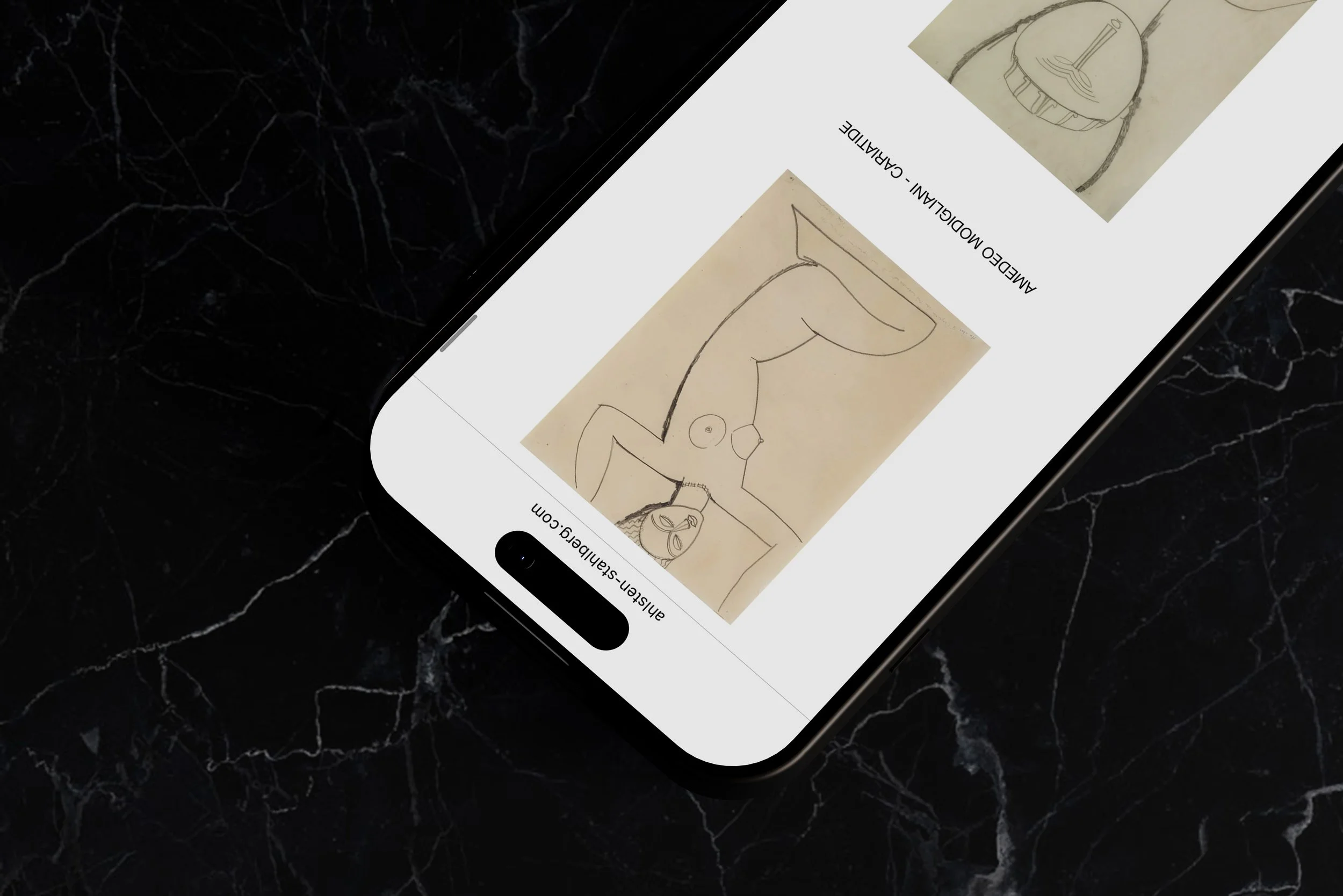
Visual hierarchy is established through generous whitespace, grid alignment, and subtle tonal contrast. Across web, print, and social, the aesthetic maintains a sense of quiet authority—allowing the art to speak while projecting a composed, contemporary voice.
Copywriting was crafted to be precise, art-literate, and editorial. Each artwork description draws on cultural references, poetic observation, and historical nuance. Brand tone remains cool yet personal, grounded yet subtly emotive.


