Dr. D’Orsay — Brand Identity Concept
Aesthetic Sensitivity and Femininity.
-
The design choices build a world around classical beauty, restraint, and visual delicacy.
The Venus logo symbol and classical sculpture imagery are doing the most symbolic work. It ties the practice to long-standing ideals of beauty and admiration of the female form. That adds a more mythic and art-historical layer, helping the practice feel culturally elevated rather than purely procedural.
The timeless color palette gives the identity a composed feel, while the classic typography and generous spacing add poise.
-
This brand identity appeals to high-end patients who are highly sensitive to taste and atmosphere, and who want the surgeon to feel aesthetically literate, and the experience to feel elevated.
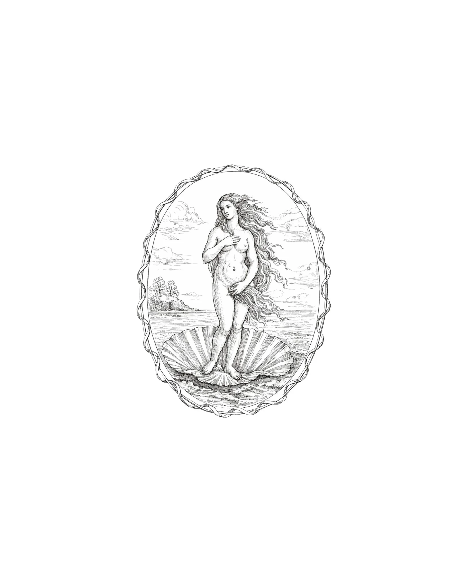
Custom logomark designed by Vitruviani.
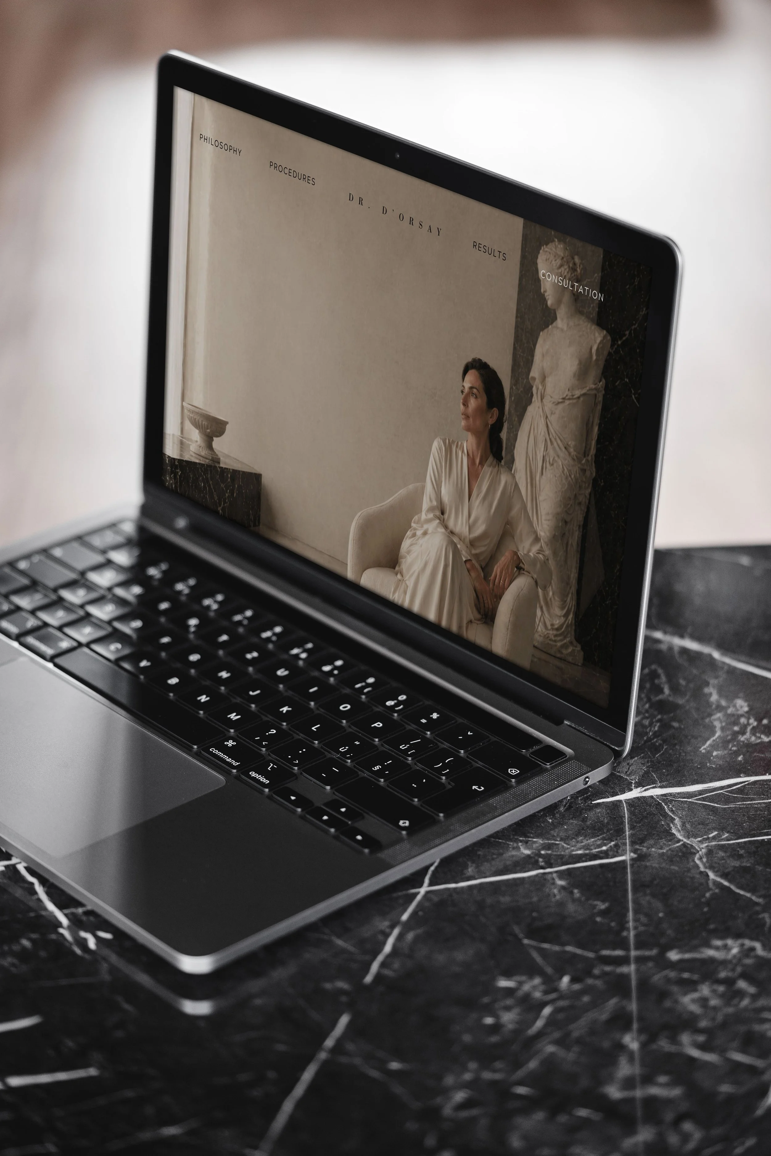
Homepage design developed for clear and consistent brand presentation across devices.
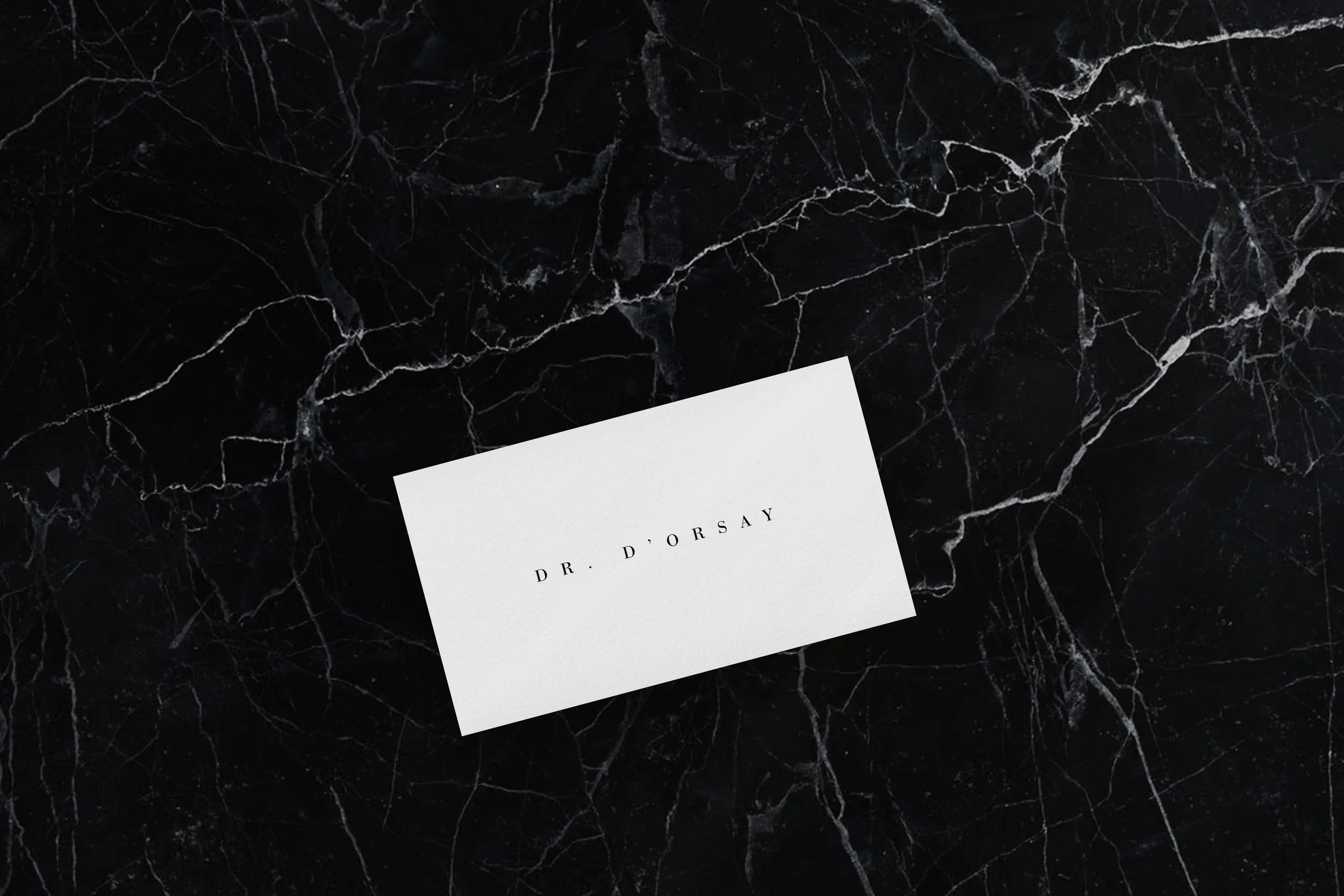
Business card design for physical brand materials.
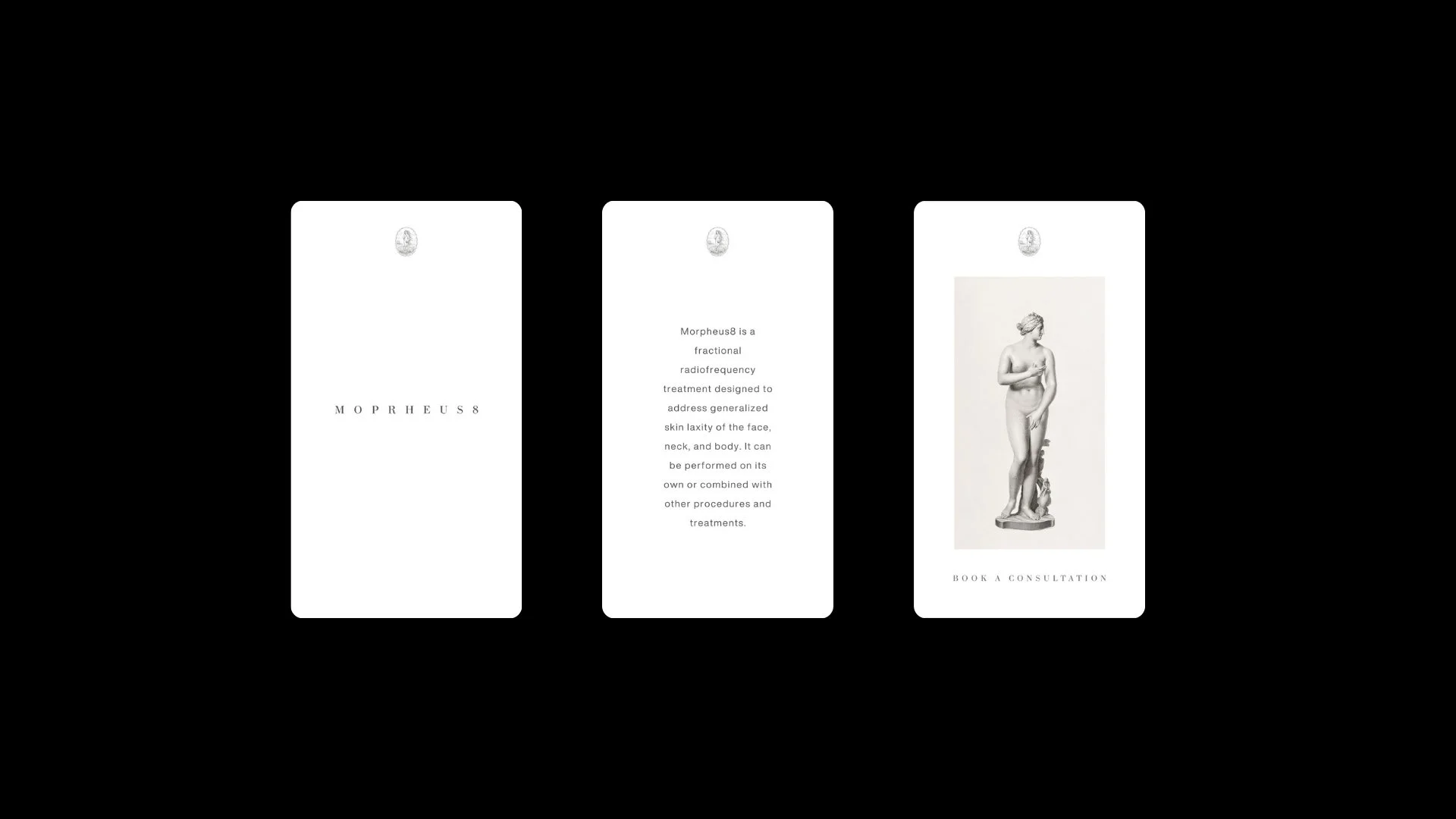
Story and highlight layouts designed for a consistent digital presence.
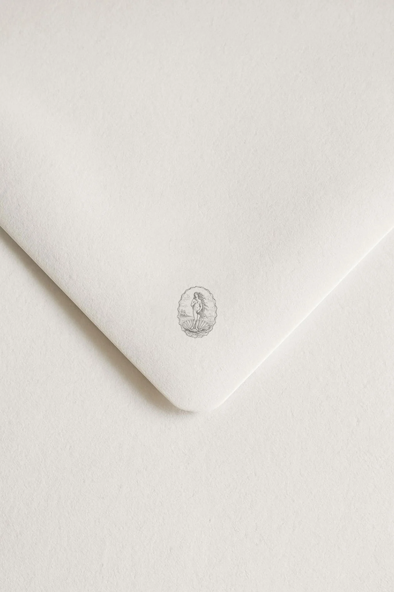
Logomark application for stationery and brand collateral.
Request a Strategy Call
Book a strategy call to review your clinic’s brand presence and marketing, with direct recommendations to refine your image and increase patient demand.